Sunday, 14 May 2017

Showcase; My Concepts on the Night

Live Model

 My male model had his army uniform on, and I had given him a sling for good measure, with his hand bandaged and covered in blood, where the blown off hand would have been. 

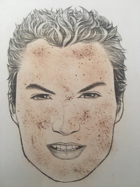
On his face I spattered him with dirt and mud using an old paint brush with the ends chopped off. I mixed brown dirt pigment with sealing gel, and spattered it all over the face and neck area. As this piece was made for TV I ensured I didn't miss details such as spattering his other hand with dirt, and the back of his neck also. 

I was very pleased with this look overall, as it caused a real shock factor for people when they walked past, and it stood out from the crowd. And where was his hand you ask?...


The hand prosthetic piece which I had made of the soldier was on the plynth on the floor next to my soldier, holding my business cards!

Perhaps this soldier was about to give me a call before his hand was tragically blown off... who knows.

My female model, the 1940's housewife character was also very successful I felt. I tried to keep as true to the era as I possibly could, and keeping it true to life for the purpose of TV. She was a glam housewife doing the cooking and cleaning, waiting for her man to return home from war.

I even put the hair in rollers which I felt was a nice realistic touch, and stays true to the era.

The overall look of this piece I feel would be great for TV. One thing I would improve is the lip line which I had to rush. As I had been at the venue all day alone setting up and still rushing around when we got to the venue sorting things for people, I only had a few seconds to apply the lip whilst our first guests were arriving. Perhaps if we were to do it again I would be more selfish and put my own work first. 


The Happy Couple


As an overall concept I feel that this was a complete look, with details considered; which made it in my opinion stand out. It was a lot of fun for me to create, even if it wasn't as arty or Avant Garde as I would usually tend to go with my make-up looks. It was something fresh for me and showed my skills as a period and special effects make-up artist. I am extremely proud of what I achieved here. If I were to do this again I would go even further with the special effects on the male model - I would have liked to have created a full arm prosthetic.


'Change' Concept


When it came to displaying my image, I was worrying because I didn't have the pictures of the model taking selfies of herself like I initially wanted. So to get around that issue and still incorporate the Instagram theme into my work, I printed off an Instagram border to put around my image. This meant that the image actually looked like an Instagram post on the news feed, with the 'like and comment' buttons underneath the picture.

I also sneakily made it my own make-up Instagram name, because you know... free publicity. Why not?

I was really happy with how this concept looked overall. I felt that it was really quirky looking due to the Instagram frame, and really stood out from the rest. 


Birthday Timeline Concept


I loved how my Birthday timeline piece looked at the showcase. I felt that it was such a striking final image, which captured attention. The issue was that as my image was already quite dark, and the venue was also quite dark - you struggled to be able to see the details which went into it. Therefore this piece is nice to go into a portfolio but didn't translate as well as I wanted it to in the flesh.


Fashion Film Concept


So the post apocalyptic film we'd created was projected on the screens in the White Room at Tiger Tiger. It looked amazing as it was being shown on the three projectors in the room. It was looped so that it played on repeat throughout the whole night. This really gave the feel of it being a Vogue style exhibition which was an added bonus. 

Birthday Timeline Concept

Take #2 on Birthday Timeline Shoot


So on my last Birthday timeline blog I discussed how I did my first attempt at the photoshoot and wasn't happy with the outcome - Click here to view blog. So I decided to do the shoot again but by tweaking a few elements of it. 

As I wasn't happy with how the prosthetic piece turned out and I struggled with blending it, I decided to change this and stick with the cheek prosthetic idea which I had initially created - which tied in with the idea of the golden ratio. I felt that this would give a much more flawless execution and a look which I could be pleased with. 

I decided after my trouble with the last face prosthetic in the shoot, I would instead use Ben Nye Nose & Scar wax to create the high pointed cheekbones which I wanted from the look.


Hair

I also decided to change the way in which I was going to do the hair for this shoot. In the previous one I had made horns which I wrapped the hair around to make the 'hair horns' on the models head. Again I wasn't happy with these as I felt that they looked messy, and almost looked like bunny ears on the head - which distracted from the look I was trying to create.


I came across this picture (Reference 1) of TOWIE star Megan Mckenna at a fancy dress party, with gold leaf brought up all the way into the hair which was backcombed and full of volume. She also did a similar look again for a snow ball (Below also reference 1) using silver leaf and glitter, bringing it down onto the face also.


I was really in love with these looks and they became a huge base of my inspiration for the hair in this piece. 
Particularly this wintery themed one on the right, as it encapsulates the idea of ice and snow - an element I felt would look fantastic in a white witch themed shoot. 
I decided to create this look with the hair, by backcombing and spraying the hair to create a beehive style look like in the above picture.
Hair gel would be mixed with silver glitter and silver leaf, and essentially pasted onto the hair to ensure that it would stick. This would also give the back-combed hair more support and structure from the use of the gel.


I designed this hair chart of how I would be styling the hair. As you can see it was really backcombed, straightened, and pushed back off the face to create a beehive style effect. 

I have also included an indication of where the cheek prosthetic will be on the face, coming down from the top of the cheekbone to the bottom. 


Shoot Day


On the day of the shoot the biggest battle that I couldn't account for was the heat. I had done the make-up in my house, but as we got on set in the forest it turned out to be one of the hottest days of the year! This made it extremely hard as the scar wax I used can begin to melt under heat, so I was conscious that we had to work quickly to get the shots done that I needed.


I was really lucky that where I'm from in Wolverhampton, there are lots of forests and woods everywhere! I live on the same road as a national trust forest, and so this was the perfect opportunity to shoot there. I felt that this fit extremely well with my piece, as it is based on a mythical creature character who hides and preys upon people - so I feel that I couldn't get any more of a perfect location than a forest. In post edit I ensured that the images looked very cool toned instead of warm, to convey the white witch aspect.


I was really pleased with how the entire shoot turned out, and the overall look was much better than the initial one which I'd carried out.


Final Images 


I was torn between these two images about which to use as my final. I liked both of them and felt that they both portrayed my character in the way in which I wanted. In the end I decided to go with the second image, as overall it is a lot more effective. It captures all of the forestry in the background and also the detail in the outfit and hair - bringing the piece together as an entire creative look.

Evaluation:

I was so much happier with these images than with the first ones I tried to create. I feel that I needed to do those first ones in order to find out what did and didn't work, and then make the necessary tweaks to create images I was happy with and proud of.

This project as a whole has pinpointed my need to practise further with prosthetics pieces, and ensure they are really well executed before putting them on a shoot; something I've learnt the hard way here.

I did find the body painting element quite tedious. I had planned on using the airbrush both times for this to ensure a quick and flawless of silver with layers of skin tone - but was told that I wasn't able to use the university airbrush compressor meaning this was not plausible for me as I don't have the means to buy my own. 

I love the way the skin looks on these images and the silver glow she is giving off is exactly the final look I was going for - creating that character of an evil white witch who preys upon people. I also captured the vanity of the virgo in these images through the models poses, and I feel as though they are really powerful when you look at them.

Considering I was also doing this outside on one of the hottest days of the year the make-up stayed on really well, and I had to act on my feet to keep the make-up in place by using fix sprays and extra adhesive on the prosthetic.


References:


1. Mulpix.com. (2016). megan mckenna towie makeupartist on Instagram. [online] Available at: https://mulpix.com/instagram/megan_mckenna_towie_makeupartist.html [Accessed 6 May 2017].

Friday, 12 May 2017

Change Concept

Change Shoot Attempt #2

So in my previous blog I discussed how I completed my first 'Change' photoshoot, but wasn't content with the result (click here to view previous blog). So I decided to do this shoot again and change what I didn't like about the first one. 

Outfit:


So one of the things which didn't go too well in the first shoot is that the clothing wasn't right for the theme. I took control of this for the second try, and bought an outfit which I thought reflected drag and the modern teen. 
As per the image on the right (Reference 1) drag queens very often wear over the top sequin dresses to give an overly feminised look. 
Sequin dresses are also a huge current trend with teenage girls, with the hashtag #sequindress having been used over 90,000 times on instagram according to it's discover page. For this reason I used a sequin dress for this second take of the photoshoot.


Make-Up

This time I decided I wanted to include even more of a drag element to the make-up than I had done previously. To do this I decided that I wanted to block the eyebrows, and redraw them on higher up and more defined. This is a very common trick used in the drag world, as having higher and more arched brows is a very feminine look. As men typically have lower down and thicker shaped brows, a lot of queens opt for blocking their brows and re-drawing them, to avoid shaving them off.

This is a tutorial which helped me a lot when I first started brow blocking, and is done by the Faux Queen Lucy Garland who I mentioned in my initial blog posts as a source of my inspiration (Reference 2).


New Face Chart

I created a new face chart as I wanted to slightly tweak some of the elements of my original design. As my last model had a really deep skin tone I loved the idea of using vivid pink with a really high colour intensity as it would really pop with her skin tone.

For the second shoot I used a fair skinned model, and so wanted to change up the colour palette slightly. I went for a mixture of berry and brown tones, with a pop of bright glitter on the lid.

See product list below, click on items to be taken to the online store.

Step by Step & Product List

- Pritt stick to block the brows. I did 3 layers of glue, leaving each one to dry before adding the next.
- Illamasqua Hydra Veil  all over the skin to prep it and soak in whilst doing the brows.
- Kryolan TV Paint Stick  to cover the eyebrows, and as foundation all over the face.
Ben Nye Neutral Set Powder all over the face, and pressed into the now covered brows with a sponge.
- MAC 'Spiked' Brow Pencil to draw on new brows in a higher up and more arched position. 
- MAC Select Cover Up concealer to perfect the shape of the brow, and as an eyeshadow base over the entire eyelid. I packed this on with a small flat concealer brush, and patted it until it dried. This is to give a better colour pay off for the eyeshadow.
- MAC 'Vanilla' Pigment under the brow bone to highlight.
- MAC 'Raizin' Blusher as the transition shade in the new 'crease'. I did this using an Illamasqua fluffy blending brush, using a clean one to drag the product out and wing it slightly.
- MAC 'Film Noir' Blusher in the very inner crease, blended out with Raizin.
- Stargazer Glitter in 'Pink Nebula' on the lid, stuck using Duo Lash Glue
- Maybelline Gel Liner in Black on the upper lash line using a Zoeva Winged Liner Brush.
- Red Cherry 'Chakra' lashes on top, stuck with Duo.
- NYX White Gel Liner in the waterline, and buffed into the inner corner of the eye.
- Red Cherry 'WSP' lashes on the lower lash.
- Illamasqua Masquara on the upper lashes, to blend into the falsies.
- Illamasqua concealer shade 'Deep 2' as contour.
- Illamasqua Highlighter 'OMG' on the cheekbones.
- Illamasqua Blusher 'Naked Rose' on the cheeks, and buffed down into the contour to blend.
- Illamasqua Slick Stick in 'Dream' to line the lips
- Illamasqua Lipstick in 'Minx'


Shoot Day


Before....

I used a glue stick on the brows, building up the product and then smoothing down the brow. I waited for each layer to dry before doing the next, and did about 3 layers in total. I then powdered the brows to set, and drew on a new brow shape higher up, and more arched.


After...


Final Images 


I decided to go with the second picture as I felt that you can see the make-up more clearly, and is more of a 'headshot' style picture which you would find on a girls' instagram.

Evaluation

I was much happier with the outcome of this second shoot, as I felt that overall it looked a lot more professional - the outfit, make-up and poses. 
Again I had asked the model to take some pictures of herself during the shoot, to fit with the theme of Instagram. Unfortunately the photographer was not willing to send these as she didn't like them, meaning the end images were not completely the vision I had in mind - meaning I needed to find another way to incorporate the Instagram element into the images. I also directed the shoot so that there were a lot of shots where you could see the models' full make-up. Again the photographer did not like these images and so would not send me them. This is really frustrating because I had spent a lot of time doing glitter detailing on the lid which you can see in the BTS pictures, but not in the final images.
There are some niggly things which I'm not overly happy with about the make-up - for example the lower lashes are wonky, and the white waterline had begun to rub off.
But I am SO proud with my efforts of brow blocking - considering it is something I've never felt confident in doing, I feel that I really pulled it off and it turned out well in the images.


References:

1. Bird, V. (n.d.). Faces. [online] Pinterest. Available at: https://uk.pinterest.com/pin/163888873912513344/ [Accessed 9 May 2017].

2. Garland, L. (2015). HOW TO: COVER EYEBROWS + FOUNDATION TUTORIAL. [video] Available at: https://www.youtube.com/watch?v=qSujd4x3zZQ&t=21s [Accessed 9 May 2017].

Monday, 1 May 2017

'Change' Concept

Change Shoot Attempt #1


So in my last blog I discussed the make-up look I would be doing within my shoot for my 'Change' concept (click here to view). 

I set up a shoot for this look and carried it out with a photographer and model. I used a model with a deep skin tone, as this is something I don't have a lot of in my portfolio, and thought it would be an opportunity to push myself outside of what I'm used to doing. 


On the day of the shoot this is the look I created to encompass my vision. As per my face charts, I wanted it to be high glam with lots of pink and glitter. I did the cut crease, the huge winged liner and over exaggerated highlight to include the drag elements which I had planned. 

In terms of what I was happy with, I was pleased with the level of colour pay of which I had managed to achieve on a deep skin tone. I used an NW15 concealer on the eye as a base, and buffed a white eyeshadow ontop before starting on the pink which I believe increased the colour pay off which I had. 


As for what I wasn't happy with, I think it very much came down to my inexperience when working on a deeper skin tone; meaning this has highlighted an area of improvement I need to work on. Although I don't think I struggled, I feel as though the make-up doesn't scream 'drag' - which was the main goal of the look. This is because I struggled to highlight areas of the face such as under the cheekbones and on the forehead, without it seeming very orange. I have since took this as an opportunity to research further about how deep skinned drag queens highlight, discovering that they use yellow powders to 'bake' and give a more authentic highlight. 

Another issue was also the costume - I'd asked to borrow a big pink furry coat from someone at college, but it turns out they had to go home before my shoot took place meaning I couldn't use the outfit I had planned. I felt this had an impact on my final look, as a black vest top didn't really show off the drag element which I wanted.


Final Image from this Shoot


This was the final image from the shoot. I wasn't totally pleased with it as a few things looked unprofessional, despite my own preparation, such as the outfit and the backdrop falling in the image. 
I had an idea during the shoot for the model to be taking selfies, in order to include the elements of 'Instagramming'. So this is something I wanted to take forward when I repeated the photoshoot as it was great for tying my whole concept together. 

Live Model Concept

Prosthetic, Continued..

So in a previous blog post I had just made my hand prosthetic (click here to view). Now it was time to start the paint job on it, to ensure a really realistic finish. 

The first problem was that my piece was made of silicone which is infamously difficult to paint. This is because the only thing which will stick to silicone without rubbing off, is silicone itself. This meant I had to create silicone paints to achieve my desired effect. 

To overcome this issue I used Clear silicone Caulking Sealant. This is the substance which is used to seal bathrooms to stop mould, and is made of silicone and comes in tubes. I then coloured this with a Red Silicone Pigment. I only needed to add a couple of drops of this pigment to the caulking, and it gave me a nice bloody red colour.


I started with a base coat of a light red, and waited for that to dry. As the inside of an arm would not be a smooth surface, I stippled the mixture on using a wooden spatula, and dabbing it to form peaks and dips, making it look like torn flesh on the inside. 
I then went in with my second coat which was a darker tone red. I added some black silicone pigment to the mixture and gradually made it darker to achieve the effect of different colours. This is important to create a realistic look, as inside flesh tones are so varied depending on the level of oxygen in the blood. 
I referred to images of blown off hands when creating this look - which I won't be including on this blog for obvious reasons!


My hand happily hanging out on the washing line to dry after its' first coat. A bonus was the drama it caused in my street when my neighbour claimed to have seen a severed human hand in the garden of number 19. 


The next thing I needed to do was paint the flesh tone onto the hand. Initially I wanted to do it the same way that I'd done the blood reds inside the hand, but to keep the detailing on the hand I would need to thin the silicone out a lot, as it is extremely thick. The product needed for this is called Naptha, and is extremely expensive to buy in the UK. So I looked at other options and was advised by Natalie from the Make-Up armoury that another option was to use cream paints over the hand, but then quickly seal it with clear silicone so that the paint can't come off.
I did this using Kryolan SupraColour Foundation Palette, mixing a few different colours to get the required shade. I wanted to keep it quite pale - as it had just been blown off it wouldn't be looking too healthy. I very lightly dabbed red into the fingertips and knuckles, using the Ben Nye Bruise Wheel, as a small amount of pinkness would be remaining in the hand. I also used a small detailing brush and the blue tone from the Ben Nye Death Wheel to create veins on the back of the hand. I stippled skin tone over the top of these to make them look more under the skin.

This was then covered in a final layer of clear silicone to set the creams and ensure they wouldn't come off on the night.

Finishing Touches


To finish off the hand I added a few more layers of blood tone inside the hand and around the wrist, leaving it to stand overnight upright so that the silicone would drip downwards and give the effect of ripped flesh. 
I also shredded and tore the excess skin I had around the hand, to make it look like flesh which had been blown off. I did this using nail clippers and tearing chunks off in a adhoc way. This gave a lot more realism to the overall look of the hand in my opinion, instead of just being a perfectly straight cut off hand.


Male Model's Face Chart


On the male models' skin there would just be basic male grooming, using powder to even his skintone for the purpose of TV. I would use concealer if needed to cover blemishes on the face. I would not apply any bronzer or anything to make the skin look healthier, as if this soldier was really in battle they would not have healthy glowing skin.

I will then use a Ben Nye dirt pigment mixed with sealing gel, and spatter onto the face with a cut up paint brush. This will give the illusion of specks of dirt from the blast which have blown up onto his face. I will continue this detail down onto the neck and any visible areas of skin such as the hand.

Wednesday, 26 April 2017

Birthday Timeline Concept

Take #1 on Birthday Timeline Shoot


So on my last blog post I discussed my ideas for the make-up, and had made my horns for the hair to be wrapped around. I created this hair chart to show the way in which the hair would be entwined into the horns and make it seem like they are part of her as a character. This to me seems more effective than just sticking a pair of horns on her, as by encompassing it into part of the character it gives the idea of how she has become this evil creature with her hair growing into horns. 
The initial plan was to use some of the hair, back comb and crimp it, then use hairspray and gel spray to wrap it around the horns. I wanted to leave the rest of the hair down to flow around it. This is also inkeeping with the Maleficent research which I did in my previous blog, who also has horns growing from her head. I wanted to take inspiration from this but make it my own, by having the horns made from hair instead of latex like in the film.


Face Chart


Product List:

Snazaroo Silver Cream Paint over the face and body as the silver base.
- Illamasqua Shadow 'Trance' from the Vital palette as contour and shading around the cheekbones.
MAC Pigment 'Vanilla' as highlight on the cheekbones, lips and nose.
- I also planned to use some cosmetic grade silver glitter and work that into the forehead area.
NYX white Gel liner  in the waterline and buffed into the eyelashes and brows.


Shoot Day 

I organised the shoot for this and hired a studio. I had the latex nose piece which I had made for the shoot, and applied it and did the hair/make-up. 


This was the initial look that I created. I stuck on the prosthetic nose piece using spirit gum, and blended out the edges using latex. 
I had some problems trying to blend the piece into the skin, as the edges weren't as thin as I'd hoped, and so you could see the line of where the piece met the cheek. Although I loved the shape and silhouette which the nose made from the side profile, I had to make the decision about what I was going to do. As you can see from the image on the right, even on my phone camera I could pick up the really harsh edges - which I knew would be magnified and picked up straight away infront of the lighting and professional camera.

I tried to think on my feet and made the call to remove the nose prosthetic. I was really disappointed as this was meant to be the focal point of my piece, and I had to remove it in order to salvage the look. 
I was disheartened but tried to make it work as best as I could in the situation, really contouring and highlighting the tip of the nose to give it the upturned effect I wanted from the prosthetic piece.

I also struggled with the hair on this piece. As the model had glued in hair extensions I could not pull the hair up flat to the head and wrap it around the horn. The model had also recently had her hair cut, meaning the hair was not long enough to cover the end of the horns as I'd first anticipated. Again I tried to think on my feet, and tried to feather the hair at the top of the horns. As the horns were made of a silver material, when I blended the hair around the top, the silver bits at the top looked like ice (which was really in keeping with the theme). So this worked to my advantage. I also used all of the models hair and took it up into the horns, instead of leaving half down as in my drawings. This is because I needed to use all of the hair to get the coverage on the horns.

Final Images (From Shoot #1)


Evaluation:

I feel that I learnt a lot from this shoot, even though I wasn't entirely happy with it, or the final image.
I made the decision to redo this shoot and rethink some of my ideas to create a more streamlined aesthetically pleasing piece. This has shown me where my strengths lie - body painting and details within the make-up. I am going to use this to create a much better final piece which I am happy with.

What I've learnt from this:
I learnt about prosthetic pieces - this was the first I'd ever made and so I learnt so many skills within that and the processes needed. I have learnt the hard way to ensure I take more time and care with making thin edges and a seamless piece - it pays off if you take this extra time.
I had challenges with the hair, I'm not confident with my avant garde hair skills and so this did push me outside of my comfort zone, which I feel is what I need to do more often. Although I feel that the hair does not look very good, it looks untidy and I can see all the areas in the final image that it should have been tweaked. But now I'm aware of these problems which can arise when doing avant garde hair ups, and I will be more prepared to handle them in future. 

Live Model Concept

Female Model

So far in my live model posts I have been exploring the injured soldier character which I will be portraying. I decided to have a second model - a female - who would act as the soldiers' stay at home wife from the 1940's. I thought this would give me the chance to show my ability to do both special fx and more of a generic make-up: both of which are skills needed within the TV and film industry. 

To begin I looked at some typical 40's makeup looks and styles which were really common and popular at the time.
From my research I found that the look on the right (Reference 1) was a really typical glamorous makeup of the era. Brows were relatively thin and arched - not as thin as the previous decade but still very rounded and pencilled in.
The eye make-up was beginning to follow a 'cat eye' style trend with winged liner being commonly worn. Shadows used were typically cool tones such as silver and grey which were subtly blended on the eye.
The skin was quite pale, with minimal bronzer and a touch of blusher. 
The significant feature is the red lip which was iconic for the era for a glamorous look.

I wanted to create a look which was very glamorous at the time, but still create a believable 40's housewife character. At the time, the women were staying at home whilst the men were fighting in the war. The use of make-up began to drastically increase as women were now more independent and going into the workplace in place of men. So the make-up was very symbolic of that new independence of women; something I want to portray. 

Hair


I felt that as I was creating a typical 40s housewife look it would be really fun and fitting to do a typical housewife hairstyle of the time.Many of the images of 40's housewives depict them with their hair rollers in with a scarf around their head. I thought this would be a nice touch as it is historically accurate and explains to the viewer a lot more about my concept and who this woman is representing.
I will therefore be leaving my models' hair in rollers for the final look.


Face Chart:


Product List:
Click on the product to be taken to the website.


Eyes:
Illamasqua Brow Cake  in Thunder to fill in the brows. I am using this as I don't want them to look to sharp or overdone by using a gel, so the wax powder will keep them looking natural.
- Urban Decay Eye Primer Potion on the lids to create a natural base for the eyeshadow to stay on. I am using an eye primer as the make-up will be on a long time and I want it to stay perfected.
'Trace' shadow from the Illamasqua Vital Palette as a transition shade buffed into the socket of the eye with a fluffy brush.
MAC 'Print' eyeshadow in the crease of the eye to darken.
NYX Gel liner in Black to create a winged liner. Set with Urban Decay 'Blackout' eyeshadow to ensure it lasts the evening. 
Maybelline Colossal Mascara in Black on the upper and lower lashes. 

Face:
Charlotte Tilbury Wonderglow Primer as a base on the skin for longer lasting foundation.
Illamasqua Skin Base Foundation, as it gives a nice medium coverage and will not give flashback for any images taken.
Jay Manuel Photo Illusion Concealer under the eyes and on blemishes.
Ben Nye Translucent set powder to stop any shine, and to set the make-up and keep it in place.
Illamasqua Blusher 'Naked Rose' on the cheeks.
- A bit of MAC Matte Bronzer under the cheekbones.

Lips:
Illamasqua 'Box' Lipstick; this is a blue undertone red which I feel is really fitting with the 40's theme. Corally and brighter reds were more prevalent in the 50's.
Illamasqua Lip Pencil in 'Assert' to line the lips and create a sharp lip line.


References:
Vintagemakeupguide.com. (n.d.). 1940s makeup styles | vintage makeup guide. [online] Available at: http://vintagemakeupguide.com/1940s-look/ [Accessed 26 Apr. 2017].
Fine Art America. (2013). Woman 1942 1940s Uk Cooking Women by The Advertising Archives. [online] Available at: https://fineartamerica.com/featured/woman-1942-1940s-uk-cooking-women-the-advertising-archives.html [Accessed 26 Apr. 2017].